Due to a computational error, the data and conclusions in this post may not be accurate.
“Old Style Metro Bus Stop Signs” by Oran Viriyincy is licensed under CC BY-SA 2.0.
In the last post, I presented a restructured transit network for Seattle. Overall, the new network, versus that of an existing weekday, improves access by 19.7%, while reducing the amount of service by 13.9%. In theory, this would allow King County Metro to operate transit service at least every 15 minutes, on nearly all the current transit corridors in Seattle, 24 hours per day, seven days per week, while still accounting for its current labor shortage. To accomplish this, the restructure eliminates service that appears duplicative. Most notably, rather than having many bus lines go through a downtown already served by the Link 1-Line, routes are altered to serve Link stations that would allow the trip to continue there. It would be an adjustment for transit riders in Seattle, but one that would improve the ability to use transit to reach destinations throughout the city.
The 19.7% access increase throughout Seattle is an average, and those can hide information. It would be hard to accept a network restructure that concentrated all the improvement in one area, at the expense of many others. A positive change in average could indicate that is happening, instead of a more desirable across the board increase. The access map is useful to see that spatial distribution, but it’s hard to look at two different maps and make comparisons. I wanted to look at the restructure in a different way. In previous posts, I have constructed a variety of measurements based on access. This post applies them to the restructured transit network.
Distribution
In Seattle’s existing transit network, the access by sector roughly forms a normal distribution, but this hasn’t been the case for every city that I have analyzed. To find out if the per-sector distribution has changed due to the restructure, I constructed a 50-bin histogram of the access by sector. I’ve tweaked the format for these graphs again. They still use a line rather than bars, which makes the graph more clear when multiple distributions are overlayed. Rather than using a single point at the midpoint of a bin, now the endpoints of each bin are both plotted. This gives the same ‘stair-step’ appearance of a traditional histogram.
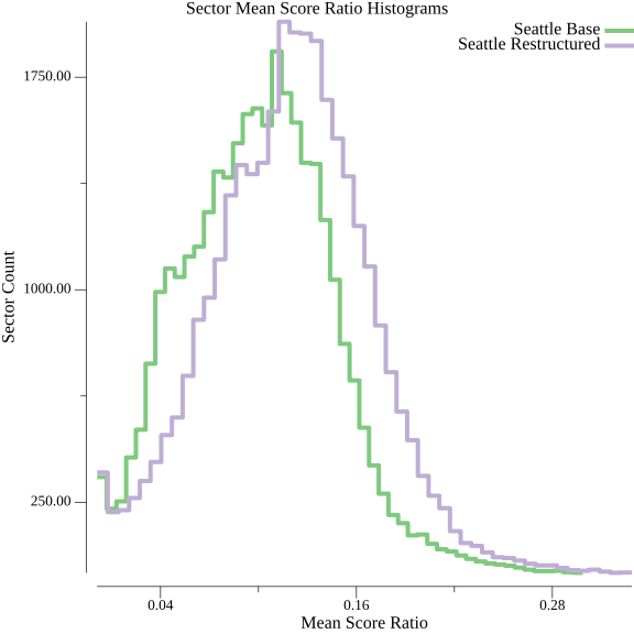
Aside from the shifted mean, the distribution appears to be roughly the same shape.
| Network | Mean | Standard Deviation | Kurtosis | Skew |
|---|---|---|---|---|
| Restructured | 0.120 |
0.048 |
0.255 |
0.086 |
| Existing | 0.100 |
0.045 |
0.188 |
0.277 |
The moments of the distribution do not indicate a drastic shift either.
The graph of the distribution doesn’t say anything about the fate of individual sectors, though. It could be that the distribution stayed the same, but sectors that were once very accessible became hard to reach, and vice-versa.
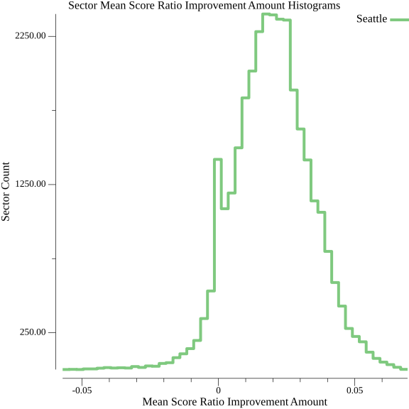
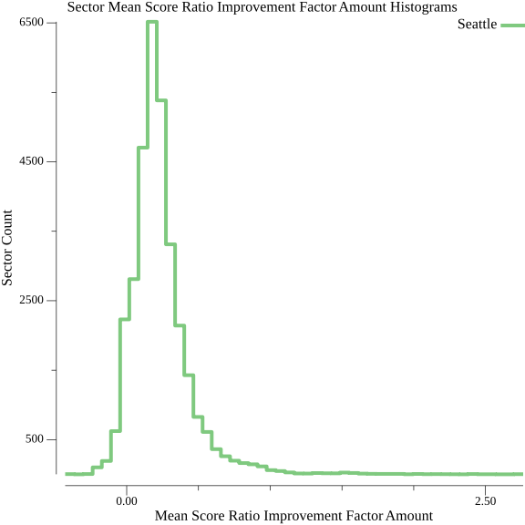
That is not the case with this restructure. Based on the 50-bin histograms of the improvement for each sector—both raw amount and the multiplicative factor by which the access of each sector changed—it appears as though the vast majority of gains are modest and positive. It’s clear that only a small proportion of sectors were negatively impacted. This result is useful for justifying the restructure. Transit agencies should be trying to grow the number of people for whom transit is the mode of choice, and that means increasing access in areas that have not had it historically. It seems counterproductive, and a little insulting, though, when existing riders who choose to live in areas with high access are subjected to a reduction in what they can reach with transit. The positive skew of the histograms clarifies what the map hints at; severely negative consequences are limited.
Comparison
When I compared Seattle’s transit access to six other cities, I found that the transit agencies serving Seattle invest the largest amount in transit proportionate to its land area, but are the worst at converting those in-service hours into an access gain over walking. Because the restructure has increased overall access and decreased the in-service hours, the latter measurement should be improved. Is it enough to get the efficiency of transit in Seattle out of the cellar?
| City | Walk Only Ratio | Transit and Walking Ratio | Transit Increase Amount | Transit Increase Factor | Service Seconds/Sector | Transit Journeys Per Service Second |
|---|---|---|---|---|---|---|
| Seattle Restructured | 0.049 |
0.120 |
0.071 |
1.464 |
560.43 |
5,940.74 |
| Seattle Existing | 0.049 |
0.100 |
0.051 |
1.059 |
652.29 |
3,690.06 |
| Spokane | 0.057 |
0.100 |
0.043 |
0.743 |
155.09 |
8,884.32 |
| Fargo | 0.092 |
0.108 |
0.016 |
0.178 |
63.32 |
4,902.04 |
| Minneapolis | 0.076 |
0.141 |
0.065 |
0.860 |
454.06 |
4,454.92 |
| St. Paul | 0.082 |
0.147 |
0.065 |
0.800 |
260.57 |
6,597.41 |
| Milwaukee | 0.044 |
0.104 |
0.060 |
1.384 |
305.18 |
10,131.15 |
| Chicago | 0.022 |
0.055 |
0.034 |
1.538 |
619.72 |
6,251.56 |
The increase in transit journeys per service second is significant, and jumps Seattle above Minneapolis and Fargo. The increase over the existing schedule demonstrates that Seattle’s downtown- and commute-focused network is an impediment to efficiently converting service investment into access. It still falls short of most cities, showing that this focus is not the sole cause of the inefficiency. This restructure made no or minimal changes to stop spacing, the time between stops, and which corridors have transit service. All these, as well as geographic properties of the cities, influence this measurement.
Route Count
Every journey—a trip between an origin and destination at a starting time—can be described by a sequence of walks and rides on transit routes. The access analysis will find the fastest path, if one can be made in 30 minutes, for every possible journey. Counting the number of distinct routes in each journey lends some insight into how the restructured network achieves improved access.
| Network | 0 Routes | 1 Route | 2 Routes | 3 Routes | 4 Routes | 5 Routes | 6 Routes | 7 Routes |
|---|---|---|---|---|---|---|---|---|
| Restructured | 37,394,983,918 |
97,438,218,225 |
41,615,756,521 |
5,317,305,713 |
160,426,222 |
2,070,168 |
18,374 |
|
| ↳Percentage | 20.55% | 53.56% | 22.87% | 2.92% | 0.09% | 0.00% | 0.00% | |
| Existing | 45,603,370,897 |
76,005,618,570 |
26,292,916,594 |
3,794,035,043 |
249,961,107 |
12,989,595 |
409,035 |
4,749 |
| ↳Percentage | 30.01% | 50.02% | 17.30% | 2.50% | 0.16% | 0.01% | 0.00% | 0.00% |
The percentage of one- and two-route rides are noticeably increased, mostly at the expense of trips comprised of walking only. In the existing Seattle network, some routes only run during traditional commute times, and every route has reduced or no service overnight. Trips that were faster during the day due to transit service may become slower walks at night. With routes running at consistent frequencies for 24 hours, the overnight period where many transit trips are replaced with longer walks goes away. I suspect this accounts for the uptick in one-route journeys.
The overall percentage of two-route rides has increased to an even greater degree. The restructure makes some routes more frequent, which increases the likelihood of there being a transfer that can be made during a 30-minute trip. This measurement understates the effect that this restructure has on the ability to make transfers. In the existing network, some routes are through-routed: a vehicle starts on one route and continues onto another. While the riders don’t physically transfer, they have ridden two routes. No through-routing exists in the restructured network, so every two-route ride involves a true transfer. The increase in three-route rides probably has a similar explanation. Many of the existing three-route rides involved a trip on the Link bridging two bus rides, and the Link now has a longer span of frequent service. Better ability to transfer contributes to the increase in access.
In the existing network, itineraries of four or more routes were mostly the result of transferring multiple times through downtown. Buses through downtown have slightly different scheduled times between the stops there. This results in trips where a rider jumps between several different routes with the shortest times between various downtown stops. Without multiple routes running through there, these itineraries go away. I’m surprised that the restructure has as many six-seat rides as it does, given that downtown route jumping is no longer possible. These trips were minor contributors to the overall access, though; their loss is not of grave concern.
Assessing the Measurements
The measurements in this post serve three purposes. Spatial distribution graphs and distribution measurements allow a better understanding of whether a restructure has adverse side effects, in spite of an overall gain in access. Comparative measurements put transit performance into a broader context. Other cities can serve as benchmarks for understanding how much impact a restructure has. Route count measurements provide some insight into how a restructure is accomplishing its aims. Together, they tell an encouraging story about this restructure. Gains are widespread and losses are minimized. The access increase is meaningful when viewed alongside that of other cities. This restructure made the supposition that giving more routes more frequency over a longer span would enable riders to reach new destinations by enabling transfers. The route count data confirm this. Combined, these measurements reinforce my contention that a restructure along these lines would be a positive step forward for transit riders in Seattle.