Whenever I talk about the way that I measure transit access, I run into a problem. The numbers are horrendous. Their magnitudes don’t line up with human-scale quantities. Consider some examples from the analysis in the last post. The number of possible journeys is in the low trillions. The total composite score works out to be a hair over 20 sextillion, a number that sounds fake. It doesn’t get better when expressing access as a ratio between the number of completed and possible journeys. Sectors around the Madison Park terminal of route 11—a reasonably frequent route—have ratios with three zeroes to the right of the decimal point. The purpose of the last two access analyses has been to evaluate whether the transit service of a sector is exceptionally good relative to the entire region. Numbers like these lack the innate sense of scale to communicate that assessment clearly.
The concepts of sectors, journeys, and composite scores, which are useful for understanding this post, are described in the previous two posts.
The prior two posts recognize that problem, and use methods of comparison to supplement the raw numbers. These methods only partially mitigate this issue. Could the Most Transit-Accessible Place in Seattle Not be Downtown? uses ranking as its means of comparison. Ranking sectors by their accessibility shows that sectors in the U District are intermixed with ones downtown. This is demonstrated by a table showing the top ten sectors by that measurement. The choice of ten was arbitrary, though; it could cover either a very small or a very large range of transit quality. The post relies on an implicit understanding that transit service downtown is exceptional compared to the rest of the city, so that any sectors ranking among downtown sectors is exceptional too. Of Buses and Ballot Boxes employs two different means of comparison: the percentile rank of select sectors and the ratio of those sectors to the top score. This revealed an apparent disparity in these comparisons. The best sector containing a ballot box was in the 100th percentile of sectors—seemingly exceptional—but, less impressively, had only 66.8% of the score of the top sector. This lead me to realize that I’d need to look at the overall distribution of transit access in order to make general statements about exceptionality.
The Distribution of Access
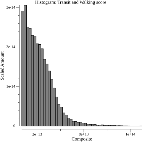
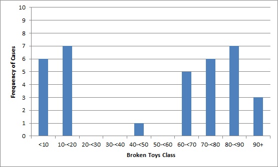
The access map provides some sense of the distribution of access within Seattle, but a histogram suits this task better. To construct the histogram, I defined 50 buckets corresponding to equal ranges of value between the minimum and maximum scores. I placed the composite score of every sector into its respective bucket. I then plotted the count of the items in each bucket. (I also scaled the counts so that they would sum to one, but this doesn’t impact the shape of the graph.)
Transit access composite score histogram.
The extreme asymmetry of the graph surprised me. On the access map, there are only a few dark purple sectors, which indicate high scores. Therefore, I did expect short bars at the right end of the histogram. I was expecting to see a similar phenomenon on the left side of the graph, though. Given the number of low-score, yellow sectors on the map, it would be less extreme than on the right end, but I was not expecting low-scoring sectors to be the dominant case. I was biased towards expecting data conforming to a normal distribution: a symmetrical, bell-shaped curve. In a variety of natural and societal contexts, measurements of an attribute taken across a population will show a tendency towards this shape, given a sufficient number of measurements. The histogram made it easy to see what I couldn’t figure out from the map alone; the composite score definitely does not look normally distributed.
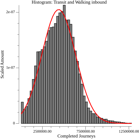
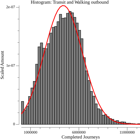
Then I thought about the value that I was graphing. “Composite” is right in the name. The measurement isn’t of a single attribute of the sector; it’s the product of the inbound and outbound journey counts. What would it look like if I graphed them individually?
Inbound completed journeys histogram overlayed with a normal distribution with parameters mean=4389577.147367, standard deviation=1946501.299000
Outbound completed journeys histogram overlayed with a normal distribution with parameters mean=4389577.147367, standard deviation=1963664.723024
The journey counts do resemble a normal distribution. To draw one fitting the histogram, it is necessary to find the two parameters that govern where the peak of the curve is centered and how stretched it is. These parameters are just the mean and standard deviation of the journey counts. This curve is overlayed in red on the histograms.
The curve is not a perfect fit. In particular, there is a hard stopping point rather than a gradual decline on the left side of the histogram. I suspect this is because there’s a practical floor for how low a sector’s access can be, since walking to other sectors is always an option. Nevertheless, a couple of statistical tests corroborate the observation that a normal distribution describes the journey counts. A standard back-of-the-envelope test is to compute the skewness and excess kurtosis of the data, and ensure they are between negative two and two. The per-sector inbound journey counts have a skewness of 0.303194 and an excess kurtosis of 0.279810; the outbound counts have a skewness of 0.223367 and an excess kurtosis of -0.049388. I also employed Pearson’s chi-squared test at a standard 95% confidence, which also pointed to normal distribution1. Between the visual inspection and these tests, I have reasonable confidence that a normal distribution defensibly approximates the distribution of 30-minute, per-sector journey counts by transit and walking in Seattle.
The Benefits of Being Normal
Why is it good to be normal? Running a bunch of calculations about the distribution of transit access in Seattle is a pretty abnormal way to spend one’s time. I find many normal things to be less than compelling, but the normal distribution is not among them! That per-sector journey count can be modeled with a normal distribution turns out to be incredibly useful.
To be clear, normally distributed journey counts aren’t a prerequisite for determining which sectors are exceptional. Since the access analysis provides journey counts for every sector, inspecting the histogram of all counts will reveal whether there are many sectors with similar counts. This relies on having the histogram available and when looking at an access map, it is inconvenient to switch between the two. There are ramifications of normally distributed data that allow exceptionality to be communicated without the histogram at hand.
Under a normal distribution, sectors with journey counts that are close to the mean of all sectors’ journey counts are common, and those far from it are exceptional. That’s not a guarantee for all sets of data. For multimodal data, where the distribution has multiple peaks, most of the values will be concentrated around the peaks, and values in the vicinity of the mean are exceptional. There is no reason that average has to imply common, even though they are conflated in normal language. For normally distributed data, though, that conflation is fine because the two concepts are directly related.
The second ramification is that there is a standard way to gauge distance. A z-score measures how many standard deviations that a number in a collection is from the mean of the collection; in essence it’s a distance from the mean. When applied to a normally distributed data, the z-score indicates what proportion of the overall data is less or greater than the given value. This mapping of z-score to proportion remains constant regardless of the parameters of the normal distribution.
Placement of z-scores along the normal distribution curve. “The Normal Distribution” is in the public domain.
For the purposes of per-sector journey counts—which generally conform to a normal distribution, but imperfectly—the z-score doesn’t say anything as exact, but serves as a useful shorthand of transit quality and exceptionality. A sector with a z-score of three can be understood to have excellent transit access relative to the mean in the measured area, and it’s hard to find other sectors like it. As long as the distribution of journeys is sufficiently normal, this scale is portable across different transit networks and regions. It works without regard to how many sectors there are and how much service there is. For identifying locations with exceptional transit within a region, z-scores provide a standard scale; that is not the case when looking at the raw journey counts. Numbers in the sextillions can be completely avoided.
Furthermore, in spite of the provocative title of the post, it’s probably best not to be overly concerned about minor differences in the ordinal rank of sectors. These rankings are out of over 32,000 sectors! Whether first or fourth in the list of reachability, it’s still surprisingly competitive with the sectors along 3rd Avenue.
There’s an assumption present in not caring about the ordinal rank of sectors. There could be a very big gap between the first and fourth best. It would be hard to observe this gap since the per-sector number of journey counts are in the tens of millions, and the table is only showing the top ten, which gives virtually no information about the overall distribution. What would a difference of 200,000 journeys actually signify?
sector
inbound
outbound
score
inbound z-score
outbound z-score
14105
12,777,828
12,133,076
155,034,358,238,928
4.309
3.943
14165
12,654,166
12,201,990
154,406,006,990,340
4.246
3.978
13991
12,816,876
11,981,967
153,571,385,275,092
4.329
3.866
21211
12,508,783
12,262,585
153,390,014,784,055
4.171
4.009
14047
12,654,054
12,114,426
153,296,600,783,004
4.246
3.934
14227
12,413,848
12,251,433
152,087,427,044,184
4.122
4.004
14291
12,309,985
12,324,269
151,711,566,525,965
4.069
4.041
14290
12,233,227
12,303,691
150,513,844,940,857
4.030
4.030
14048
12,677,091
11,775,885
149,283,965,750,535
4.258
3.761
21063
12,559,396
11,882,498
149,236,997,851,208
4.197
3.816
With the z-scores, and the understanding that their typical range is a known quantity, it’s far easier to see that there is not a large gap. The top ten sectors are all exceptionally good, compared to the rest of Seattle. My assertion was correct, but it feels a lot better to have it actually supported!
A Brief Look Ahead
In future access analyses, I intend to use z-scores when assessing the per-sector quality of transit service relative to the region. There’s an important caveat to that; being able to use them relies on continuing to see journey counts that are normally distributed. I have no reason whether or not to believe that a normal distribution is some fundamental property of access via transit and walking. Changes in King County Metro’s or Sound Transit’s schedule could alter the distribution of access such that it’s no longer normal. Agencies in different regions might have different priorities in their transit service, which could yield entirely different distributions.
Spending time thinking about distribution has resonated with me in another way. The comparative access analyses that prompted this post aren’t about slicing data to reveal fun facts about transit in Seattle. Ultimately, my goal in identifying exceptionally good sectors in unusual places, or unexceptional sectors in areas of heavy investment, is to discover ways to improve service throughout the network. In theory, the primary way that access analysis can drive improvement in public transit is pretty simple. Propose changes to a transit network informed by previous analyses, run new analyses to test whether they increase the overall number of completed journeys, and, if they do, make those changes to the network. Changing a transit network is obviously not that simple, but even if it were, distribution suggests something else to consider. Two hypothetical changes could similarly increase the total completed journeys, but alter the per-sector distribution of access in different ways. Checking that total number of completed journeys increase is easy, but is there a specific per-sector distribution to aim for?
As an aside—this is not particularly germane to this post from a transit perspective—I eventually developed a working theory for the shape of the composite score histogram. I’m stating this without proof, but I think that inbound and outbound journey counts are likely to be nearly equal for the same sector. Therefore, multiplying them together (as is done to form the composite score) is very similar to squaring either one. This post determined that both of these counts are approximately normally distributed. The sum of the squares of n normally-distributed random variables is a (potentially shifted) chi-squared distribution with n degrees of freedom (k=n). Thus, the graph should resemble a chi-squared distribution with one degree of freedom (k=1).
The chi-squared test statistic was 0.055473 for inbound and 0.035215 for outbound, compared to a critical value of 65.170769. The critical value was determined by the .95 quantile of a chi-squared distribution with 48 degrees of freedom (50 categories minus two parameters). I had to unearth my old statistics textbook for this, so if this is a flawed application or execution of this test, please let me know! ↩︎

