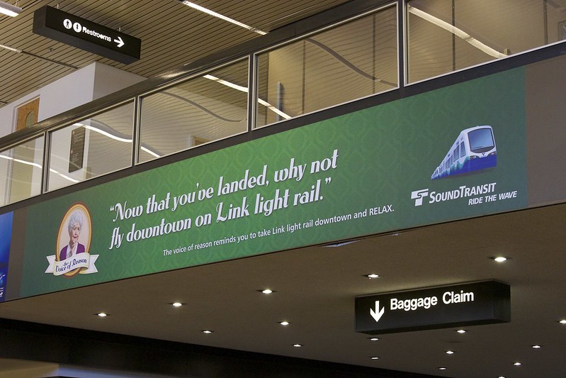
“Link light rail ad at Sea-Tac Airport” by Oran Viriyincy is licensed under CC BY-SA 2.0.
As I was running the access analysis supporting Of Buses and Ballot Boxes, I encountered something that fascinated me. It wasn’t relevant to the piece itself, so I didn’t emphasize it there, but I knew it had to be the next thing I investigated.
I needed a way to test my suspicion that the ballot box designated by King County Elections as serving downtown was far less transit-accessible than other points in the downtown core. My analysis would divide Seattle into a grid of 80 meter by 80 meter sectors, and score them using a transit access measurement. Sorting the sectors by their score would allow me to compare the one containing that ballot box to others in downtown Seattle, which I knew, for sure, would dominate the top of the list.
I ran the query to get the sorted list of sectors and was shocked when I saw that the top result wasn’t located in downtown at all! Instead, it was sector 21260, encompassing the northern extent of the U District Link Station, a region between Brooklyn Avenue NE and University Way NE, right around NE 45th Street. How could the most transit-accessible place in Seattle not be downtown?
| sector | score | description |
|---|---|---|
| 21260 | 155,317,803,810,234 |
NE 45th between Brooklyn NE and 15th NE |
| 14127 | 154,636,898,964,232 |
3rd between Union and University |
| 14186 | 154,530,852,132,510 |
3rd between Pike and Union |
| 14013 | 153,308,075,899,095 |
3rd between Seneca and Spring |
| 14069 | 153,067,558,069,848 |
3rd straddling University |
| 14247 | 151,724,127,132,044 |
Corner of 3rd and Pike |
| 14310 | 151,091,958,128,115 |
4th between Pine and Pike |
| 21112 | 151,089,604,308,988 |
NE 43rd between Brooklyn NE and 15th NE |
| 14309 | 150,129,975,591,584 |
3rd between Pine and Pike |
| 14374 | 147,344,373,241,056 |
Pine between 3rd and 4th |
Some Local Context
In downtown Seattle, 3rd Avenue is a designated transit corridor, with cars prohibited from 6 AM to 7 PM. There are a lot of King County Metro routes that use it to go to or through downtown Seattle. Metro’s route numbers are roughly partitioned by region, with numbers under 100 primarily serving Seattle1. Of the 46 routes in this range, 28 of them serve downtown. Not all these routes are frequent, all-day routes, but many are. Additionally, the three Rapid Ride Bus Rapid Transit routes with service in Seattle all go through downtown. There are so many buses that transit drivers are given specific operating instructions for the area to avoid interfering with each other. Under all this bus service, the Westlake, University Street, and Pioneer Square Link stations serve a stretch of downtown less than a mile long. The emphasis on transit in this area is very visible.
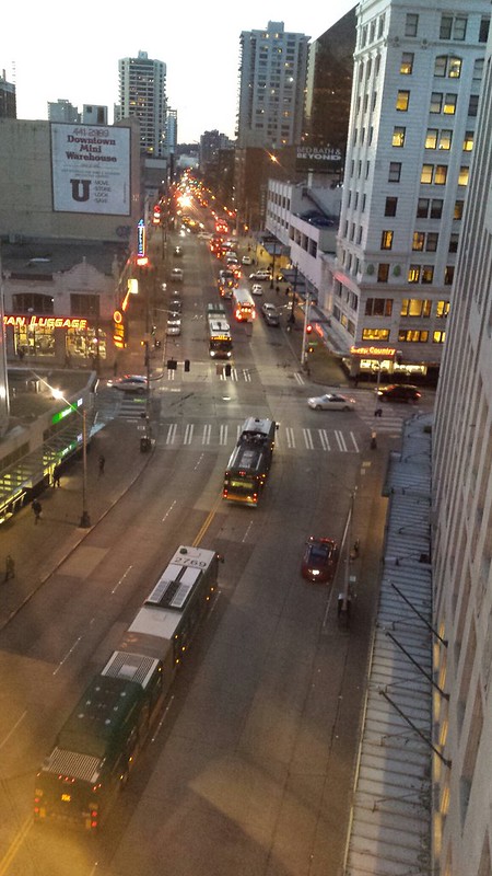
“Looking west down 3rd Ave, busy night, buses, emergency vehicles as seen from Macy’s overpass, downtown Seattle, Washington, USA” by Wonderlane is marked with CC0 1.0.
The vicinity of U District Station doesn’t feel as transit-focused. The area does have abundant transit; in addition to the Link station, 13 of the aforementioned 46 buses operate around this area2. But while the 3rd Avenue corridor looks like an explicitly transit-focused place, the area around sector 21260 doesn’t feel that different than other Link stations throughout the city. Outside of an eastbound bus lane on NE 45th Street and a single block on NE 43rd Street that is transit only, there aren’t transit-priority features to speak of. Yet according to the analysis, it’s easier to reach this area than anywhere downtown.
The Measurement, Revisited
Making sense of this ranking requires an understanding of how the access analysis evaluates reachability. It starts by dividing the city of Seattle into a grid of 80 meter by 80 meter sectors. It then constructs pairs of every sector as an origin, and every minute of the day as a starting time. For every pair, the analysis determines how long it would take to reach each of the other sectors using transit and walking. I call the combination of origin sector, destination sector, and start time a journey. If the journey can be made in 30 minutes or less, it is considered a completed journey.
This allows every sector to be assigned a score, formed from two components. The inbound component is derived by counting all the completed journeys where the sector is a destination. The outbound component is derived by counting all the completed journeys where the sector is an origin. These are multiplied together to produce the sector’s score. Thus, areas that can be reached the most often from the most other places, and can reach the most other places the most often, will have the highest score. In that way, the score models each sector’s transit accessibility.
Location Matters
It’s worth noting that in this analysis, the accessibility of an area is not just a function of the transit service in its vicinity. The fastest path between some origin and some destination at some time of day might be to forgo transit and walk3. If that walking time is under 30 minutes, the journey still counts as completed, and thus counts towards accessibility in this measurement. As a regular rider of transit, when I think about what I can reach, I’m largely agnostic about mode. Thirty minutes spent exclusively walking doesn’t feel different than 30 minutes riding one or more buses. What matters is that I’ve exhausted 30 minutes of my day. Thus, I see no need to exclude walking-only trips. I’d consider changing this if the total travel time allowance was much higher—in that case walking the whole time might seem onerous—but, for a 30 minute trip, I consider that the measurement factors in reachability by walking to be a feature, not a bug.
Nevertheless, thinking from the perspective of planning transit rather than using it, it’s useful to understand how much the walkability of a location influences the overall accessibility. It might reveal that the unexpectedly good reachability of sector 21260 might have nothing to do with transit at all.
Downtown and the U District have features that impact how easy they are to reach when walking. When downtown, one can only go so far southwest before running into Puget Sound, and many walks northeast are constrained by there being a limited number of crossings of Interstate 5. Walking trips around U District Station contend with obstacles that are somewhat further off, with Portage Bay to the south and I-5 to the west. These qualitative descriptions, though, are of little help in determining how much impact those features have on walkability.
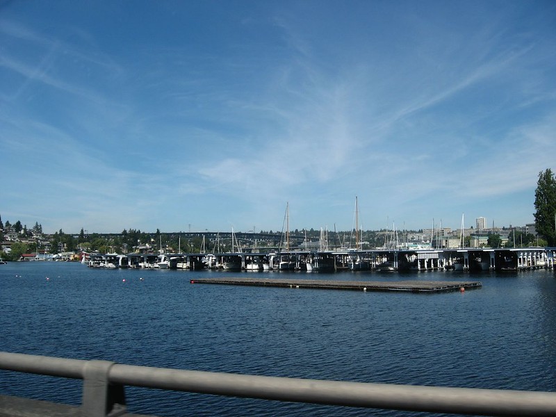
“Portage Bay, Near the University of Washington, Seattle, Washington” by Ken Lund is licensed under CC BY-SA 2.0.
To make this quantifiable, I conducted a second access analysis, using the same map of Seattle and 30-minute time threshold, but removing all the transit service. With that, I could break the ability to reach a sector into a walking component and a transit contribution.
Comparing these analyses, I noticed something that didn’t make sense. Some sectors were more reachable in the walking-only analysis than in the one including transit service. This shouldn’t be possible; the addition of transit service can’t make locations harder to walk to. There had to be a problem with the analyses, and eventually I found it4. I corrected the problem and re-ran the analysis.
This time, comparing the walking only and combined analyses yielded a sensible result. But when I sorted the sectors in the transit access analysis, the most reachable sector now was downtown, on 3rd Avenue, between Union Street and University Street. The U District sector that was formerly most reachable—now sector 21211 on the new map—had fallen to fourth. According to this second analysis, the most transit-accessible place in Seattle is in downtown.
| sector | score | description |
|---|---|---|
| 14105 | 155,034,358,238,928 |
3rd between Union and University |
| 14165 | 154,406,006,990,340 |
3rd between Pike and Union |
| 13991 | 153,571,385,275,092 |
3rd between Seneca and Spring |
| 21211 | 153,390,014,784,055 |
NE 45th between Brooklyn NE and 15th NE |
| 14047 | 153,296,600,783,004 |
3rd straddling University |
| 14227 | 152,087,427,044,184 |
Corner of 3rd and Pike |
| 14291 | 151,711,566,525,965 |
4th between Pine and Pike |
| 14290 | 150,513,844,940,857 |
3rd between Pine and Pike |
| 14048 | 149,283,965,750,535 |
3rd between University and Seneca |
| 21063 | 149,236,997,851,208 |
NE 43rd between Brooklyn NE and 15th NE |
There’s Still Something Here
It’s tempting to regard the first analysis as totally incorrect, on account of the bug. The second analysis answers the title question, and the answer is “no.” It’s a result that would make sense to anyone familiar with transit in Seattle. Of course the most accessible place is downtown, because there’s a dedicated transit roadway, a lot of bus service there, and several closely spaced Link Stations. I assert that that conclusion neglects to consider everything that the results are showing.
The bug did not apply in many circumstances, and while the analyses used the same algorithm, some of the underlying data changed between runs. The access analysis sources street data from OpenStreetMap, and that data is continually updated. That’s evident in the total number of sectors: the first analysis divided Seattle into 32,535 sectors, while the later one created 32,4705. The transit service also changed in the intervening time, such that there was slightly less of it in the second analysis6. It is very possible that at some point in time, the area around the north end of U District Station was the most transit-accessible place in Seattle.
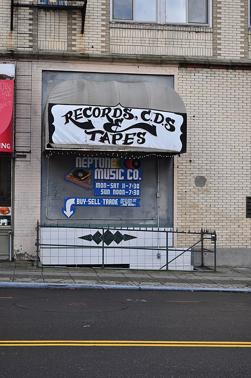
“Neptune Records, Neptune Theater building, University District, Seattle, Washington, USA.” by Joe Mabel is licensed under CC BY-SA 4.0.
Furthermore, in spite of the provocative title of the post, it’s probably best not to be overly concerned about minor differences in the ordinal rank of sectors. These rankings are out of over 32,000 sectors! Whether first or fourth in the list of reachability, it’s still surprisingly competitive with the sectors along 3rd Avenue.
The question of whether this surprising reachability is the result of good transit or superior walkability remains, and these new analyses provide an answer. For each sector, I subtracted the number of walking-only completed journeys from the completed inbound journey count and the completed outbound journey count. I then multiplied those terms to get an adjusted score. Under this measurement, sector 21211 ranks 15th. Thirteen sectors forming a contiguous stretch of the downtown core from Stewart Street to Spring Street, and one sector near Pioneer Square Station, receive a larger contribution from transit than it does.
| sector | score | walking score | adjusted score | description |
|---|---|---|---|---|
| 14165 | 154,406,006,990,340 |
6,401,304,806,400 |
97,919,248,624,260 |
3rd between Pike and Union |
| 14105 | 155,034,358,238,928 |
6,681,191,040,000 |
97,325,844,619,728 |
3rd between Union and University |
| 14047 | 153,296,600,783,004 |
6,614,360,985,600 |
96,210,394,165,404 |
3rd straddling University |
| 13991 | 153,571,385,275,092 |
6,921,529,574,400 |
95,250,134,777,652 |
3rd between Seneca and Spring |
| 14227 | 152,087,427,044,184 |
6,688,637,337,600 |
94,985,728,048,344 |
Corner of 3rd and Pike |
| 14290 | 150,513,844,940,857 |
6,459,730,560,000 |
94,610,544,712,057 |
3rd between Pine and Pike |
| 14291 | 151,711,566,525,965 |
6,755,840,640,000 |
94,438,054,169,165 |
4th between Pine and Pike |
| 14355 | 147,831,094,618,234 |
6,651,447,321,600 |
91,767,301,549,594 |
Pine between 3rd and 4th |
| 14048 | 149,283,965,750,535 |
7,005,126,758,400 |
91,568,911,870,215 |
3rd between University and Seneca |
| 14166 | 146,960,868,185,208 |
6,830,904,960,000 |
90,415,922,294,808 |
Union between 3rd and 4th |
| 14226 | 143,834,031,217,503 |
6,481,708,646,400 |
89,238,345,104,223 |
Pike between 2nd and 3rd |
| 14356 | 145,404,493,595,732 |
6,823,379,865,600 |
89,231,029,823,252 |
Corner of 4th and Pine |
| 14354 | 140,791,491,020,416 |
6,408,593,510,400 |
87,116,249,646,976 |
3rd between Pine and Stewart |
| 13719 | 145,332,416,903,284 |
7,430,639,846,400 |
86,946,331,681,684 |
3rd between Cherry and James |
| 21211 | 153,390,014,784,055 |
9,505,135,641,600 |
86,524,032,026,935 |
NE 45th between Brooklyn NE and 15th NE |
| 14104 | 140,018,064,937,155 |
6,430,484,505,600 |
86,417,274,391,875 |
Union between 2nd and 3rd |
| 14292 | 142,438,486,393,744 |
7,081,559,654,400 |
85,983,480,229,264 |
Pike between 4th and 5th |
| 21062 | 149,236,997,851,208 |
9,040,365,158,400 |
84,787,431,481,928 |
NE 43rd between Brooklyn NE and 15th NE |
| 13990 | 138,714,152,822,772 |
6,614,360,985,600 |
84,710,545,913,652 |
Seneca between 2nd and 3rd |
| 14422 | 139,886,187,598,188 |
7,212,447,360,000 |
83,561,579,520,588 |
Pine between 5th and 6th |
Sector 21211 still has remarkably good transit, ranking in the top .05%. There are sectors along the downtown bus corridor that cannot match its transit access. It feels like these sectors should utterly trounce sector 21211 in terms of location-adjusted transit access, but they don’t. In nearly all ways, the downtown sectors have an advantage. There are more bus routes. There are places where multiple Link stations, not just one, are within reasonable walking distance. Subtly but importantly, downtown is located closer to the middle of the Link. There are only two stations north of U District Station. On that basis alone, starting at a downtown Link station allows for reaching more other Link stations in the 30-minute time budget. While there are a greater number of highly-accessible sectors in downtown than around the U District Link station, on an individual basis they aren’t much better—at best .66%. That’s surprising to me.
Speculating as to Why
Because this analysis looks at the combination of thousands of times of day, tens of thousands of origins, and tens of thousands of destinations, it generates trillions of datapoints. Getting from the ‘what’ to the ‘why’ poses a challenge, and often requires re-running the whole analysis with some factors changed. With this much data, tracing observed phenomena to their causes is a multi-step process.
The first step is to speculate. There are two broad classes of causes that I consider. One class is that there could be errors modeling transit and walking that could impede the reachability of downtown and elevate that of the U District area. The second class assumes the model is accurate enough, and that the unexpectedly small difference in the amount of reach has real-world causes.
This analysis has a clear weakness in how it places Link station platforms. Sound Transit publishes its schedules in the standard GTFS format. While GTFS has the ability to separately specify station entrance locations and platform locations, Sound Transit doesn’t use this functionality. Even if it did, this analysis doesn’t currently consider it. Thus transit platform locations are essentially pushed up to the surface, and associated with a location on the nearest road, sidewalk, or path. Depending on how close that location is to nearby bus stops, this could over- or under-estimate the amount of time it takes to walk between the two modes. In the GTFS, the Link and bus stop locations happen to be very closely co-located for U District station. I don’t want to overstate that as a source of error, as the station entrances are well positioned for making bus transfers in reality. Aside from this, I don’t see other issues with the model that would systemically diminish downtown or overvalue U District Station.
I speculate that these results indicate that there are diminishing returns from running a large number of buses on an identical path through downtown. I believed this before running this analysis, so there’s the potential I’m being biased by a preconceived notion. Nevertheless, I can relate several aspects of transit service in downtown Seattle to the ways that they may impede optimal access.
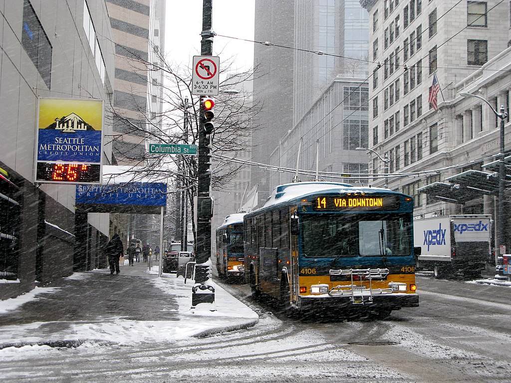
“Seattle trolleybuses in snow, downtown in 2008” by Oran Viriyincy from Bothell, WA, United States is licensed under CC BY-SA 2.0.
As mentioned before, due to the large number of routes going downtown, there are specific rules for driving a bus on 3rd Avenue. To avoid running out of curb space at stops, each route only serves a specific set of them. From an access perspective, this presents a problem. To optimize access, all routes would serve stops that would be aligned with Link stations, allowing an easy transfer between modes. Instead, a bus might stop two blocks away from the nearest Link station. In contrast, buses that go through the University District generally converge on one of three sides of U District station, very close to the entrances7.
Also, sending a large number of buses down a single path only makes a small number of destinations highly accessible. A person trying to go down 3rd Avenue never has to wait long; they could board nearly any bus, as well as the Link. Between ends of downtown, there is extremely high frequency. When a rider has other destinations in mind, though, this frequency isn’t useful. In some ways, it is harmful. Given a fixed budget of service hours, high frequency in one spot starves others of service; it might be more effective for frequency to be more balanced. For a location to be well-scored by this analysis, it must be possible to reach a broad variety of destinations frequently. I suspect the duplicative patterns of bus service downtown are not conducive to that. The routes serving U District station overlap much less, before branching off to different areas. Perhaps this plays a role in how it possesses comparable access with less service.
What’s Next?
This suggests an experiment. I speculate that the removal of bus service from 3rd Avenue could, paradoxically, be part of a service adjustment that would increase transit access to downtown sectors. Consider if every route that traverses the whole corridor was instead truncated and redirected to serve the first downtown Link station that it approaches. The operating hours would be reinvested in more frequency on the Link and on the remaining portions of bus routes. A more-frequent Link—with its dense stop spacing downtown—and walking, would be the sole options for trips between points in the core. Improved frequency on bus routes could mean riders would wait less when traveling beyond it. For this to be anything other than speculation, though, would require extensive manipulation of schedule data and a new access analysis.
This all started as a simple look at the transit access of an oddly placed ballot box. That analysis helped validate the suspicion that I held, but incidentally revealed something that compelled me to look deeper. Could the most transit-accessible point in Seattle really not be downtown? Investigating that new oddity necessitated a new measurement. Factoring out the walkability component from the overall access exposed what the latter couldn’t say definitively: downtown Seattle does not have unparalleled transit access, in spite of many reasons why it would seem that way. The causes of that are now ripe for analysis, and this could inspire new ways of thinking about how Seattle’s bus system could look. I love this process of jumping from one observation to the next, uncovering both the causes and further topics to explore. It’s not just about satisfying intellectual curiosity, though. The lives of people are enriched when they reach their desired destinations more quickly and more often. That’s what a more thorough understanding of transit access ultimately offers.
-
There are also routes in the 100s that have considerable service in Seattle that are not included in this, notably the 106, 107, 120, 124, 125, 128, 131, and 132. Only the first two do not serve downtown. ↩︎
-
Additionally, route 372 serves the station. This route has considerable service in northeast Seattle before serving destinations north and east of the city. ↩︎
-
Or use a mobility device, such as a wheelchair or scooter. While this analysis assumes a fixed speed and the ability to traverse all kinds of terrain, it could be adapted to model different restrictions that individuals face while moving through their environment. ↩︎
-
Ultimately, I found an issue where a street that was perfectly aligned with a latitude or longitude grid line would only have one of its ends associated with the sectors along which it lay. ↩︎
-
This appears to be partially, but not exclusively, due to OpenStreetMap now indicating that the roads within the National Oceanic and Atmospheric Administration campus are private. ↩︎
-
This might also be affected by making access to the NOAA campus private. The bus service that goes through this area is no longer counted in the service hours. ↩︎
-
Except for the 65/67 in a way that utterly baffles me. ↩︎