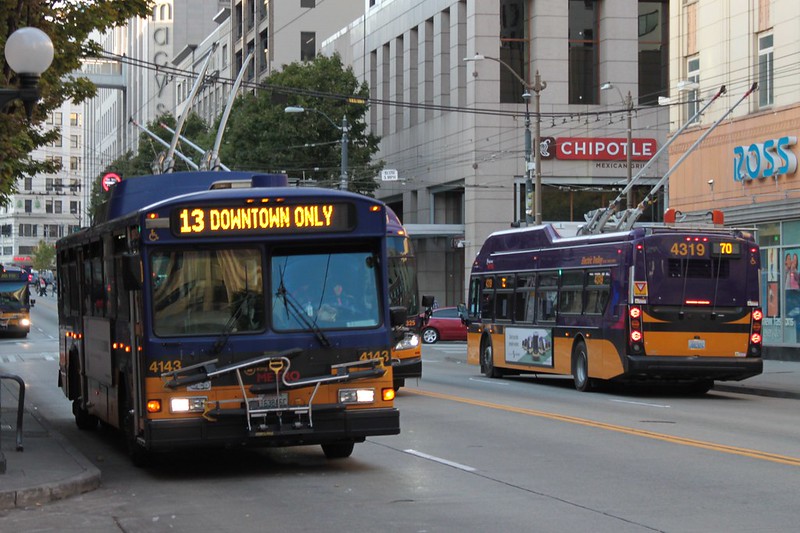
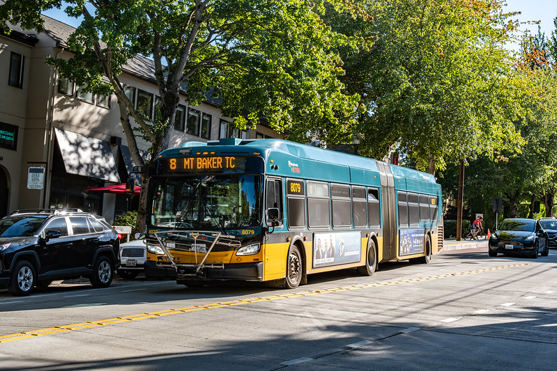
Even if all King County Metro’s “commuter” bus routes were shunted to Link Stations, downtown Seattle would still teem with buses. Many of the transit routes that run entirely within Seattle serve downtown, converging on Third Avenue to create a transit mall. In this proposal, as with past ones, this stretch of road would go from having the greatest amount of bus traffic in the city to being nearly devoid of it. But why mess with this longstanding feature of Seattle’s transit network?
For the third year, I’m proposing a full network, in-service time neutral restructure of Sound Transit and King County Metro’s public transit service in Seattle. This year, I’m adjusting my approach slightly. Previously, after I established a budget of service hours available, I would test large, wide-ranging batches of changes against it, repeating this until I was close to the line without going over. This time, I’m parceling changes by theme, in hopes of better appreciating the savings and costs of different types of changes.
Also new this year is that I am balancing the service time budget not in terms of expenditure within Seattle, but throughout King County1. The impetus for this is a change in how I’m computing access2, but it’s fundamentally a more accurate assessment of expenditure regardless. The in-service time from segments of transit trips that crossed the Seattle border were unaccounted for in previous attempts. By expanding service-time measurement to the county level, this is only a concern for portions of service that leave the county, of which there are far fewer. This change is particularly germane to the routes featured in this post.
Want a one-sentence summary of every post in this blog? “Here is some data that argues for a radical change in the policies of public transit agencies.” This theme belies my overall satisfaction with the public transit in my life. Yes, I’d like to get places faster and wait less, especially at night and on weekends. But I don’t feel isolated from the city’s opportunities without a car, and it’s a critical component of how I control my cost of living. My life would be worse without it. I can demand improved transit, while still recognizing the great merit of what exists today.
In that spirit, access measurement can be used to celebrate something good, rather than to denounce detrimental policies. And in Seattle, Sound Transit’s Link 1 Line is good.
Ever since I read this Seattle Times article on the South Lake Union Streetcar, I haven’t been able to get the phrase “streetcar opponent Eugene Wasserman” out of my mind. Homer’s works use epithets (in the term’s original sense) to describe an existential characteristic of an entity. I’m sure this Eugene Wasserman is a multifaceted human being, but in this article’s story, he is a character in the same manner as “swift-footed Achilles.” So it’s not intended as a personal attack when I say that I find the idea of a “streetcar opponent” to be absurd, and emblematic of how stupid discourse around streetcars tends to be. When thinking about what differentiates the value of a transit route, the type of vehicle operating it doesn’t matter that much, compared to the route’s measurable properties. Inhabiting the role of “streetcar opponent” just doesn’t make sense.
That being said, as I’ve developed some access-based measurements of public transit routes, Seattle’s streetcar routes have stood apart. They are comfortably worse than all King County Metro bus routes that primarily serve Seattle, when considering two such measurements, the percent replaceable and journeys per in-service second. Given that, is being a “streetcar opponent” actually a sensible position?
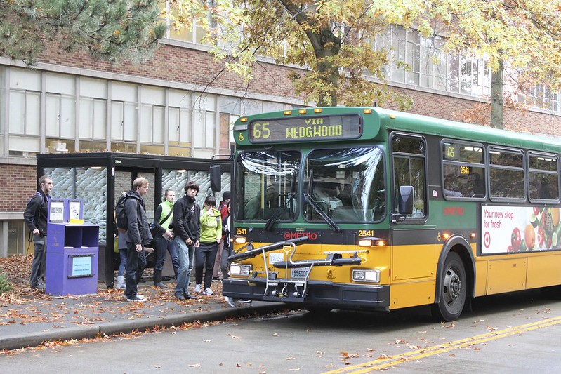
After working in tech, where force-feeding disruptive changes to users is commonplace, the world of public transit planning feels like a group of indecisive friends struggling to decide on a place to eat. Modifications to bus routes involve consulting a litany of stakeholders. Those aren’t just riders, but businesses and residents along the route, as well as groups representing other road users. For the RapidRide J Project, a joint effort of King County Metro and the Seattle Department of Transportation (SDOT) that is converting the former’s route 70 to a Bus Rapid Transit line, outreach started in 2015. Unfurling the Outreach Conducted to Date section on its project page reveals almost 100 sessions. The commonality among all of them is that they involve parties who are geographically close to the course of the modified route.
Ridership-based route productivity measurements—those which compare a route’s average number of riders to its cost of operation—are common within transit planning. Unproductive routes will be the first considered for elimination when funding is tight. Those that perform well may merit additional service when the budget supports expansion. I have previously argued that ridership-based measurements are, at best, incomplete for these purposes. There are factors beyond ridership that determine how much impact the elimination of, or investment in, a route will have. Transit routes have varying amounts of capability, regardless of how many people choose to take advantage of it. The transit agencies that I’m familiar with entirely neglect this factor, though, perhaps because they lack a way to quantify it. Measuring access offers a solution. While this style of analysis has become increasingly common at the network level, using it to compare the contributions of routes within a network has not.
I’ve recently improved my access analysis software to adjust walking speed based on change in elevation. The use of a constant walking speed, regardless of terrain, in previous analyses opened them to legitimate criticism, especially in hilly Seattle. A walking model can now be selected when computing an access analysis. At this time, there are two options: the original constant-speed model, and one that attempts to characterize how an average person navigates changes in elevation. Obviously, this is not a complete solution to the problem of accurately modeling how people get around. After all, walking speed is affected by elevation change in different ways for different people, and, for some, walking is not how they get around at all. Allowing for any variation is merely the first step on a path toward the ability to model the experience of any transit rider.
Transit access is frequently depicted with isochrone maps. Given a starting point, time of day, and time budget, determine all the places that can be reached within that budget using transit and walking. These maps are not a new concept, with examples dating to the late 1800s. This site’s glossary depicts one of Melbourne, Australia from the 1910s as an example. Public transit consultant Jarrett Walker uses them aptly to explain the idea of access as a “wall around your life”. The bounds of the isochrone form this wall. Improvements to transit networks expand the area inside of it. It’s a compelling, understandable image.
This is a revised examination of a measurement of how individual transit routes contribute to overall access in Seattle. The first attempt was subject to a computational error that caused incorrect figures to be reported for certain routes. This iteration fixes that issue, and also uses updated schedules for King County Metro and Sound Transit that will take effect on September 14th.
The first version was presented in a series of parts. In each part, I chose a group of thematically similar routes and computed five measurements for them. I now find this approach to be somewhat clunky. These measurements don’t have clear “good” or “bad” values; they are only useful in comparison. Thus, it was difficult to meaningfully evaluate the routes chosen in the early part of the series. This revision presents all routes at once.